Goodies from Canadian Architect and Design Quarterly

I photograph a lot of projects for a lot of clients. I shoot, edit, hand off the images, and like a bird sent off to fly on its own, sometimes I never see them again in use. Other times, I come back some months later and just when I'm not expecting it…"hey, that looks like one of my photos!" And sure enough, it is.

This happened with this month's issue of Canadian Architect. Given the high profile of the very small space, my photos of Bruce Carscadden Architects' Burns Block Micro Lofts have been widely reproduced, and it's not uncommon for someone to write an article about micro-loft living and for one or more of my photos to accompany it. Kudos to DIALOG's Bruce Haden for a good piece of work. Check it out in the January issue.

Sometimes "late surprises" happen with editorial content as well. Last year, I submitted an article for MediaEdge's Design Quarterly on photographing projects, based roughly on my talk a year past at BUILDEX on construction, real estate, and architectural photography. Design Quarterly was at the time in the throes of redesigning their website, so I blasted it off to them and then promptly moved onto other projects. Since Design Quarterly is one of the sponsors of BUILDEX, I thought "hmm…wonder what happened to that article?" And sure enough, up on their website, there it was!

Picture Perfect Projects

And on that note, I'm hoping to see you all at BUILDEX in a couple of weeks! We won't be exhibiting this year, but I will be at both the Interior Design and Architecture keynotes, and the opening networking event. Looking forward to catching up.

It's calendar time!

calendar14b

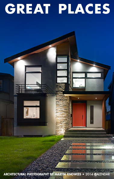
It's that time of year. Yes, you guessed it: calendar time! If you've worked with us in the past couple of years, yours will be on the way soon. If you've never received one before and you'd like one, please let us know so we can get one to you. We're continuing with our well-loved "tall and skinny" format that our clients and friends tell us is the Right Size for Everything--it will fit perfectly on the end of any 2x6-framed partition wall, in your cubicle, on the A-pillar of most construction vehicles, in a binder with room to spare, or plenty of other places.

Big shout-out to Victoreric Design Group, Jenny Martin Design, VisionBuilt, Allen + Maurer Architecture, Stephanie Robb Architecture, David Nairne and Associates, and DGBK Architects (via the West Van Museum), for the cool projects to photograph over the course of the year.

Video: Winning an Ovation Award

We were recently asked to do a 15-minute guest talk to the GVHBA Renovation Council on photography for the upcoming GVHBA Ovation Awards. Having been photographing projects for the Ovation Awards since they were introduced a few years back as the renOVATION Awards, I took the opportunity to share some of our road wisdom with the group. There was also considerable interest in having a video version of the talk, so we put one together:

Congrats to our Georgie finalists and AIBC winner!

It's a great week when we get to congratulate our clients for making a strong showing in not just one but two awards programs over the course of seven days.

Congratulations Allen + Maurer Architects for their win of the  2013 AIBC Special Jury Award for Atypical Approach to a Typical Building Type! (a Serious Mouthful Of An Award Category Even By Architectural Awards Program Standards. One of the coolest things about the President's Awards Gala, the culminating event of the AIBC Annual Conference last Friday, was the recorded voiceovers reeling off the awards categories and project descriptions with a classically dramatic movie trailer voice. Archi-speak + big announcer voice is always a win in our books).

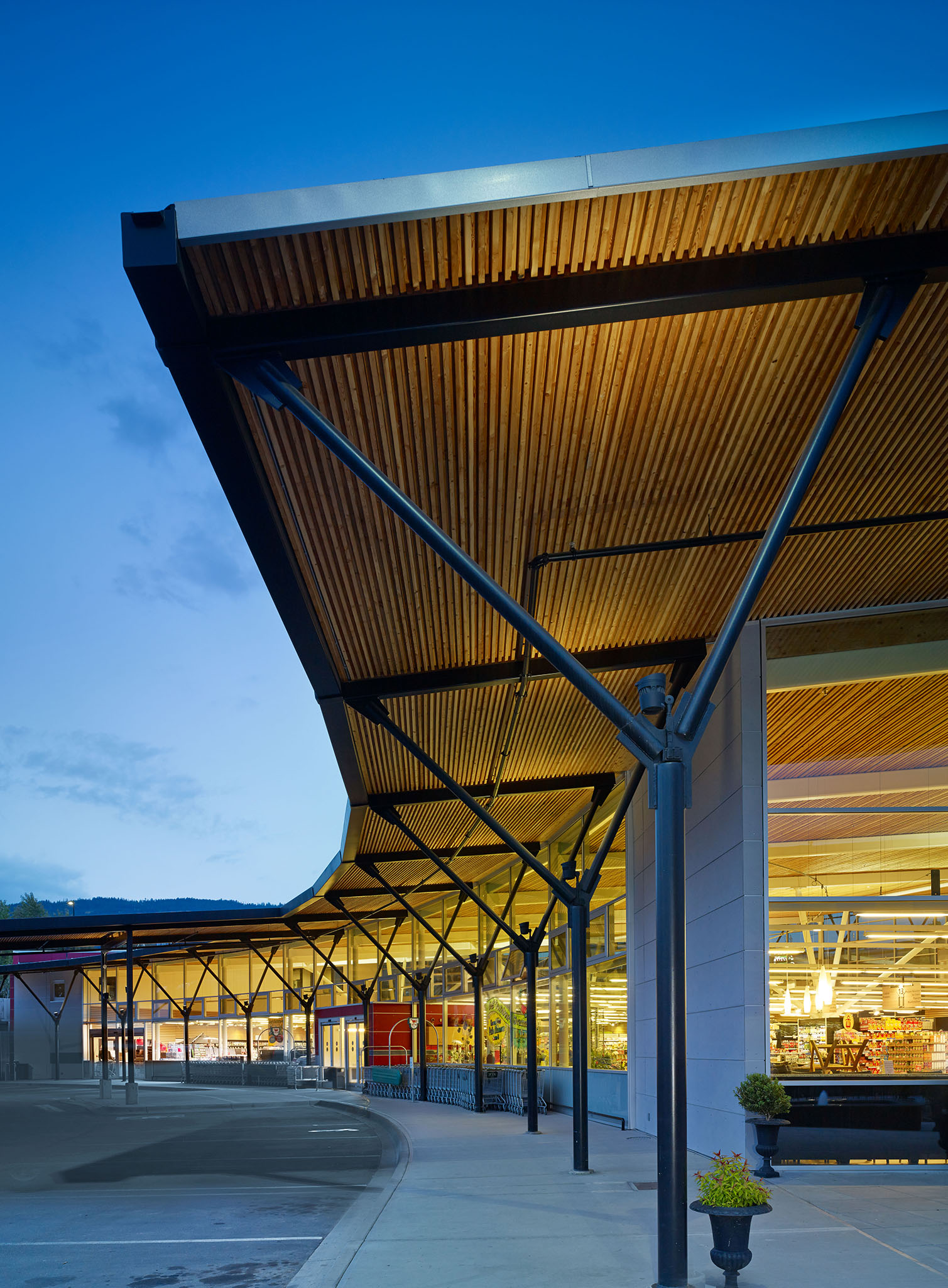
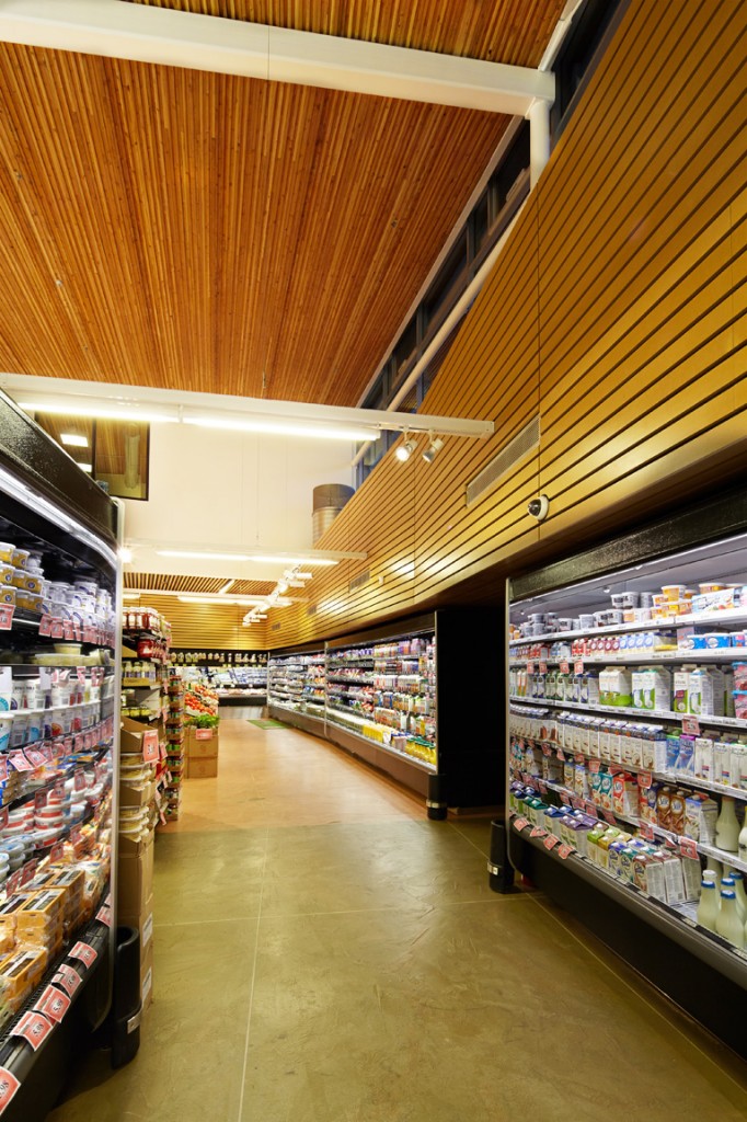
We photographed their project, Askew's Store, up in Salmon Arm early last summer, and the results looked great. It also was a great use of our medium format technical camera gear, as we got to use every last drop of the gorgeously large dynamic range you get when shooting on a technical camera. Grocery stores can be a pretty banal sort of building type, but the curved design, architectural detail, and copious use of BC wood elevates this project. As one juror said, "Someone loved this project." The architects and client weren't the only ones who loved it--we loved photographing it and are very happy it got recognition. This is one of our featured projects, so you can go explore the photos.

maurer-askews1650


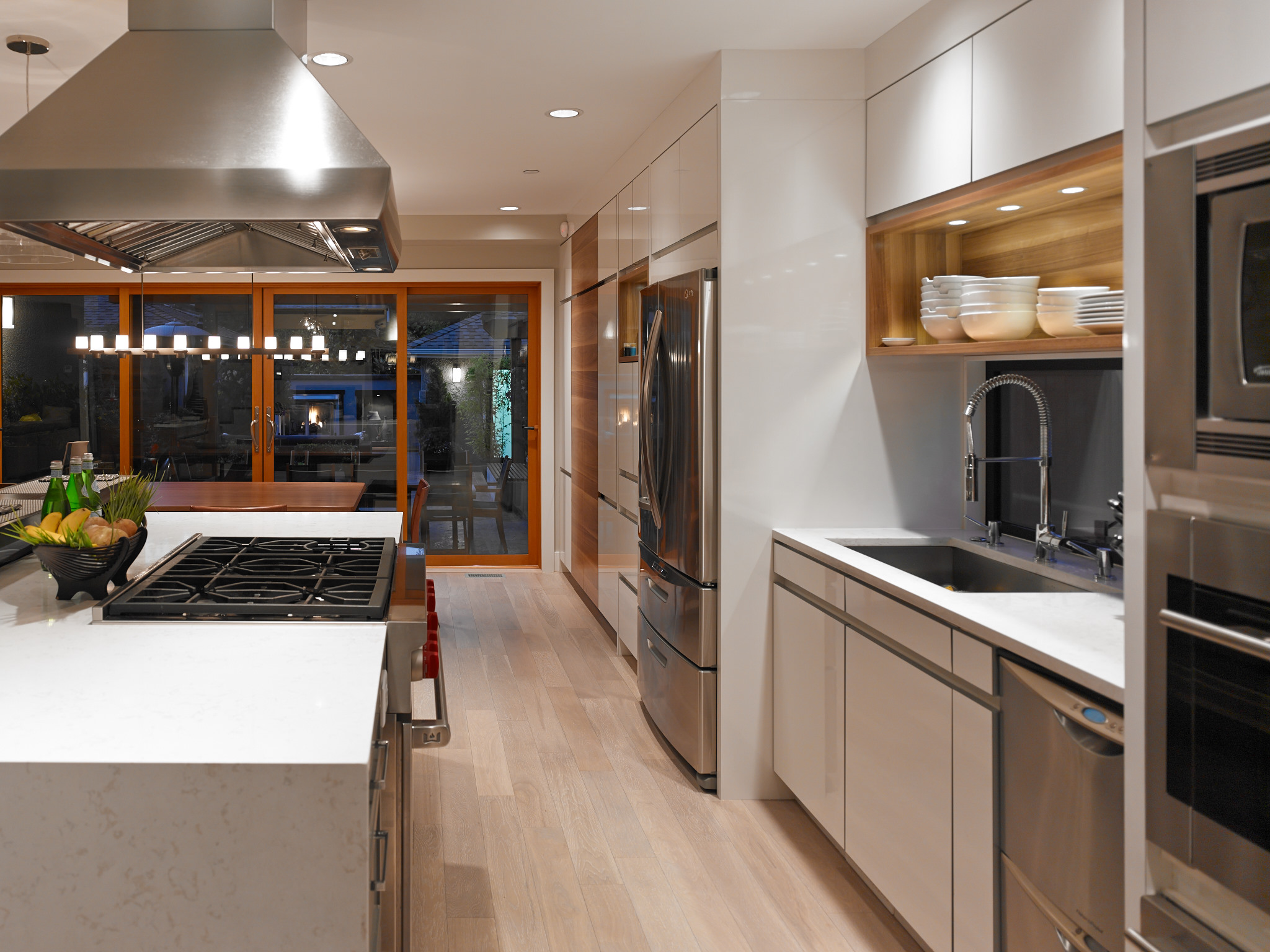
We also just got the welcome news that two of our other projects are 2013 Georgie Awards finalists. Congratulations to the crews at Vision Built and Jenny Martin Design for placing in two categories for West Side Renovation, which is a 2013 Finalist for Best Residential Renovation Over $800,000, and a 2013 Finalist for Best Kitchen Renovation Over $100,000. We always recommend entering in as many categories as your project could reasonably place in, and besides giving your project a wider "footprint", sometimes it also means that you place in multiple categories as well. Who doesn't love more chances to win?

visionbuilt-w375712


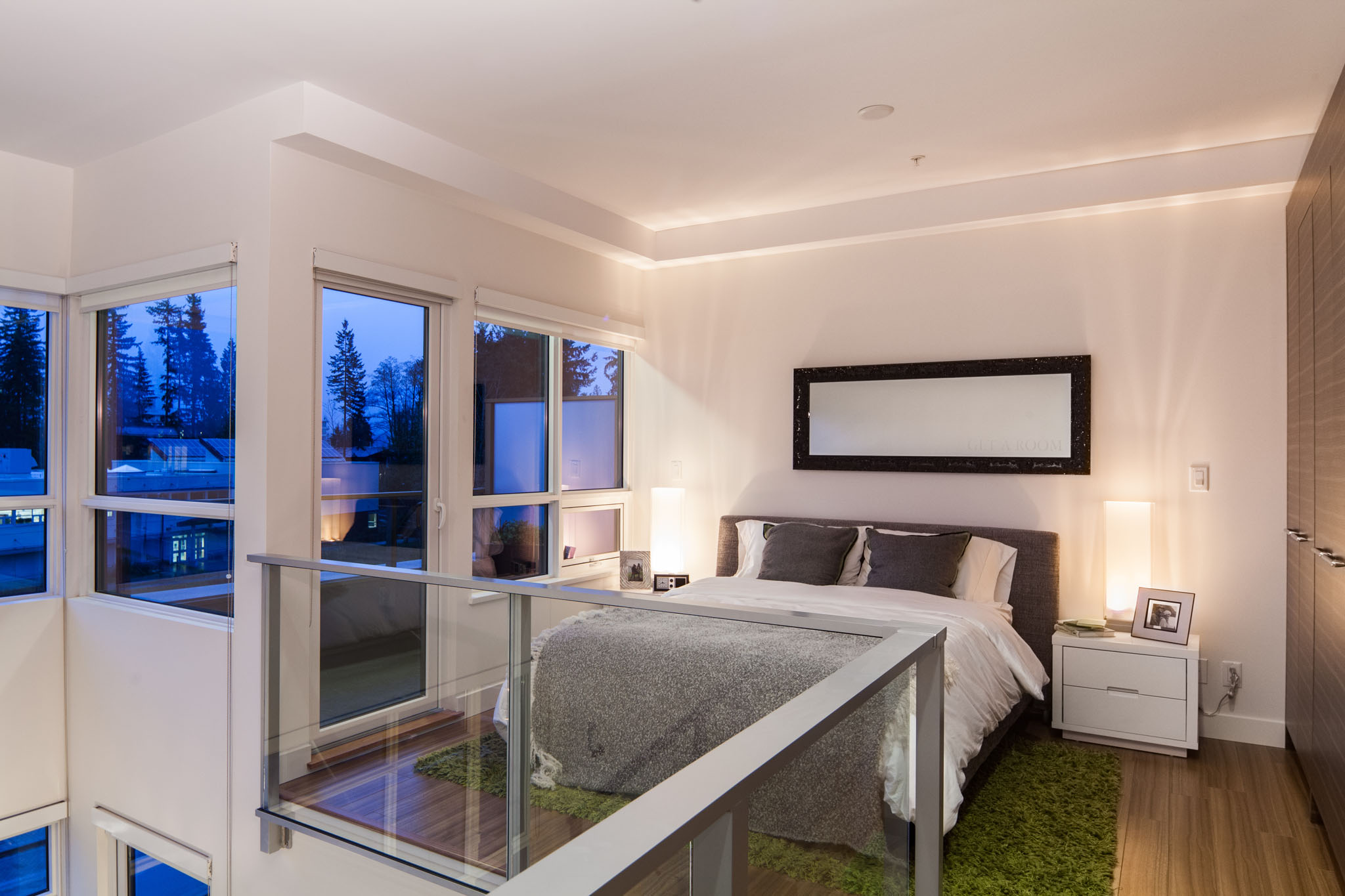
And last, but by no means least, is the amazing showing by Porte's Origin project up at UniverCity at SFU. We photographed this for the Ovation Awards in the frozen dead of early December (in fact, we had exactly 10 minutes when the sun poked through the overcast gloom and lit up the south elevation…which we got to use by having a Genie lift at the ready and watching the sky carefully) last year. After it won two Ovation awards, the Porte team wisely decided that it could go further and would benefit from another visit to photograph the now-properly-furnished amenity spaces and now-properly-grown-in landscaping. It's a rare pleasure getting to do this: you get to see how a project changes, and it's always fun to see how things turned out and fill in a few gaps without having to be consistently blowing sheetrock dust off your camera lenses. The trip was worth it: Origin is a 2013 Georgie Awards finalist in three categories: Best Multi-Family Low Rise, Best Environmental Initiative, and the coveted Residential Community of the Year. Given that they are one of the few loft-style developments to do the Right Thing and orient the loft to actually get as much light as possible and not feel like a bunker, I'd happily move in to one of their units if only they were downtown and not on the hill (as an SFU grad, I've spent enough years looking down at the city, as pretty as that view is!)

MKPhoto-9697-Edit

Fortifying the Adorama CS500 Lighting Bag

Fortifying the Adorama CS500 Lighting Bag

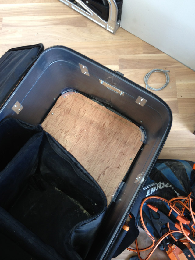
I'm a mostly proud owner and frequent user of Adorama's now-discontinued "CS500" lighting bag. It's an inexpensive, pretty solid, and most importantly, voluminous bag: it will hold a 40" boom stand (one of the few bags under $300 that does), a bunch of smaller stands, a lot of LED lights, and a whole load of other bits and pieces of grip, and will just fit in a Car2Go Smart car (with the front passenger's seat folded down), or across the back seat of most subcompact cars. There's one little problem with it, though: the clearance between the wheels and the bottom of the bag isn't quite enough to keep the bottom of the bag from dragging on the ground if the bag is fully loaded. Which, after a couple of photo shoots, causes the bottom of the bag to rip:

cs500-mod1Not good. It occurred to me, though: all it takes is a piece of aluminum angle and a quick run to Home Depot to solve this problem. This bag is constructed to be sort-of user modifiable: the inside padding can be removed if you find a #0 zipper and put it on the zipper track:

cs500-mod2which nicely separates the "outside" from the "inside" and gives you access to the balsa wood bottom (which we'll be drilling into), and the plastic exterior (ditto).

Being a bit of a packrat when it comes to useful parts, it turns out that I had the perfect piece of aluminum angle already around my storage area: the angle support from an Ikea Expedit bookcase. A quick run with a reciprocating saw to cut it down, a few screw holes later, and...voila!

cs500-mod4Almost there! Just a quick bit of measuring, a few screws and washers (I "upgraded" the inside washers to larger fender washers...when you carry around 50lbs of sandbags in your grip bag, it never hurts to be a bit anal and overengineer things!) later, and the wheels were back on. The hard part was reattaching a zipper to the zipper track to zip the interior back together. But, when all is said and done, the bag works well and actually looks pretty decent underneath also...not that anyone's going to be looking at it!

cs500-mod6And there we go. I also took the liberty to haul out the glue gun and squirt hot glue into all the bottom-facing screw heads, which should hopefully keep them from scratching anyone's floors on location.

A [Vancouver] Special Article

We're proud to be a big part of the article on Vancouver Specials in the September/October issue of Canadian Contractor. It's available in digital edition here. Kudos to our clients Stephanie Robb ArchitectTQ ConstructionQuinton Construction, and our fellow GVHBA member Intermind Design for the good work and good press.

One of the benefits of working with us is getting media attention to your project like this. We often work with a number of architectural/construction-oriented magazines who usually are one the lookout for interesting projects. We'd photographed Stephanie Robb's East 3rd Ave renovation a good while back, and the editor of Canadian Contractor was looking for photos of other interesting Vancouver Specials to flesh out their Creative Eye section. We've photographed a number of Vancouver Specials over the year, and when they wanted one with a creatively refit interior, we naturally thought of TQ's West 22nd project, which we'd photographed for them right before it was featured in the Parade of Renovated Homes earlier this year. A few quick phone calls and emails around later, and...we got several "double-truck" magazine spreads, which we love being part of, and TQ got another opportunity to show off their project, and everyone wins!

5 Tips for Better Georgie Awards Entries

It's Georgie Awards time again! The call for entries went out last week, which means that many of you are probably figuring out what you're going to enter, when, and all that. Since we've been providing Georgie Awards photography for over half a decade, it's time to share a few bits of road knowledge we've picked up along the way.

1. What category are you entering in...and what other categories?

That's obvious, right? You look at your project budget, whether you're a reno or a new build, and find out which "slot" it fits into. But if your project is a whole-house renovation or a new build, you can take it one step further: with a little bit of planning (and a bit of work in Excel to divvy up your project budget) you can enter parts of the same project in other categories that might have different or less competition. Do you have an onsite sales centre as well? Does your renovation have a stunning outdoor room? Is this a new build with a fit-for-an-Iron Chef kitchen? Once you've assembled everything for one category, you've already done a good chunk of the work to enter an additional one. 

The trick is to make sure you fulfil both the technical and the photo requirements for the additional category. If you're having us do your photos, our Georgie Awards photo packages have enough images to cover two categories, assuming that a number of photos can be reused (often with a bit of cropping) in both categories. We also make it easy to license the two or three additional images you might need if necessary. If you're going to enter multiple categories or are strongly considering it, let your writer and photographer know in advance so we can make sure things are covered and avoid extra visits.

2. Your project is special: let everyone know why.

Some parts of your project are obviously visually stunning: maybe it's the odd-angled custom countertop or the perfectly framed view of Stanley Park. Other parts of your project may be less obvious: the under-stair lighting, the ability to control the whole place from your iPad, or the off-grid heating setup. Some things will photograph well, and some things will come up only in the written part of your entry. Tell your writer and photographer where and what the less-obvious things are so that they get covered somewhere in your entry so that the judges will know as well.

3. Get organized.

We're talking about your entry requirements, of course, but you also want to make sure that your project looks as good as possible when it's photographed. If there's a bit of construction still to be done, it's a good excuse to get the finishing trades through to take care of deficiencies, and if there are any major things that would appear in photos, hide/fix them or point them out so they don't get featured inadvertently. If the place is occupied, make sure the owners clean up the kids' toys out of the living room and wipe up the crumbs out of the stove. If the place isn't occupied, think about getting some furniture staged in. Empty spaces don't show as well as ones with a bit of "fluff" to show how the space could be used.

If your project is still under construction, there's a fine balance here between having photographs done too early and having the place look unfinished, and risking missing the deadline. If you're in this situation, let your photographer know so we can (hopefully) reserve some time for you at the last minute.

4. Write tight. Or find a good writer.

You have a grand total of 350 words for the written part of your entry--that's half the length of this post. That's not much, so use it well. Use your word processor's Word Count feature to help you edit. Terrified by a blank page? There are several good writers in town that specialize in doing this sort of work. We're happy to recommend them.

5. Share the costs.

We hate to admit it, but photography can be one of the biggest expenses in preparing your entry. You might not have to carry the entire cost yourself, however. Did you use an architect or interior designer on the project, or was there a specific trade that played a pivotal part in the project? Let them know you're entering, give them the opportunity to be credited as an affiliated firm on your entry, and see if they're willing to share the costs of your Georgie Awards photography in trade for being able to use the photos in their portfolio as well. Let us know and we can coordinate costs and logistics so everyone gets the photos they need.

BONUS: Hooray, your entry is done! Now what?

Once you've wrapped your entry up, sent it off to the CHBA, and are sitting back and enjoying a glass of your favourite beverage, the last thing you want to think about is...doing another entry. However, most awards programs have relatively similar requirements. Once you've entered a project in the Georgie Awards, you have most of what you need to enter the GVHBA Ovation Awards if you're in Metro Vancouver, or the CARE Awards if you're on the Island. You're also a few bits of formatting away from a SAM Awards entry, or a Department G Award if you're BuiltGreen. Entering multiple awards programs lets you spread the costs around, and gives you even more good PR if you win. It's also worth remembering that now that you've pulled everything together for your entry, it's also a great time to blog about it, update your web site, hand everything over to your graphic artist for new tradeshow display signs, or put out a new print ad. The possibilities are endless!

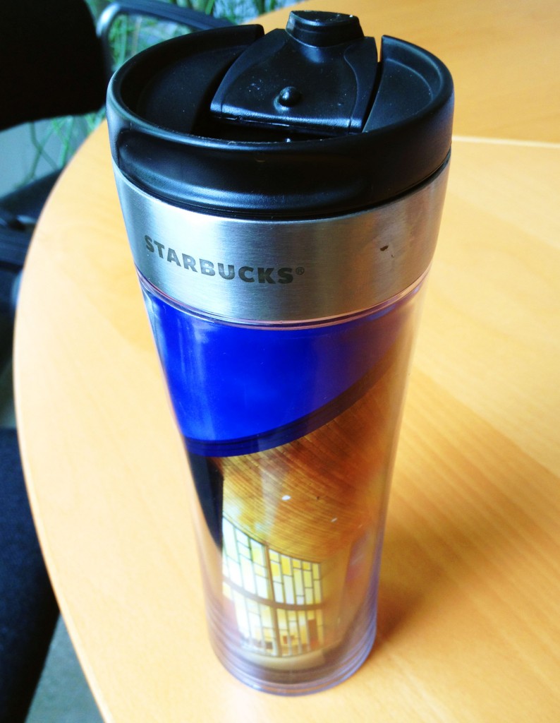
Offtopic: Customizing the new Starbucks 16oz Stainless Tumbler

photoMany of you know that my love of photography and architecture is only matched by...the depth of my caffeine addiction. (And if you don't, well let's just say: don't try calling me before 10am unless you know I'm on location or am heading to a location...in which case I likely already have my latte in hand or have guzzled it before leaving). When I was on my way out to photograph recently up in BC's Northern Interior, the unthinkable happened: my trusty travel mug fell apart, leading me to go hit the nearest Starbucks to replace it as there was no way I was going to be able to run a camera on 4 hours of sleep after a 5am start otherwise. I found this fine stainless tumbler which also comes with a free dry-erase marker, ostensibly for customizing the mug, but I think it's really to remind people like me who've had to suffer through too many early morning meetings about the ideas that can come from that heady miasma of dry-erase marker fumes and fresh coffee. Now you're glad this blog post isn't Scratch and Sniff.

There's one problem with this mug: unlike previous incarnations of the Starbucks 'create-your-own tumbler' mugs, the new mug doesn't come with a paper insert if your taste in customizing runs towards things on paper. There doesn't seem to be one available online either, so there was no choice but to create one. Here it is in PDF format; enjoy! (And if you work for Starbucks: you can redistribute this for the price of a good solid gift card!)

MYO Tumbler Template - PDF


A Fine Time for Vancouver Heritage

MKPhoto-7052-EditIt's been a few years since we've photographed projects for the annual City of Vancouver Heritage Awards, but this year we photographed at least two projects that were submitted, and we're pleased to be able to congratulate a couple of our clients on their Heritage Awards wins.

Congratulations to Robert Lemon Architect, Fast + Epp Structural Engineers, Murray Wystrach Construction, and homeowner Janet Campbell for their work on the McLean House, a.k.a. the Campbell Residence, which earned them an Award of Honour. This house was also featured in the March/April issue of Homes and Living Vancouver, and is a marvellous example of how to restore heritage elements and combine them with a modern addition, creating a set of simultaneously cozy and airy spaces in a large home. We're looking forward to hearing what Janet does with the turret; the home was open this past weekend as part of the Vancouver Heritage Foundation's annual Heritage House Tour, and she had a piece of paper posted in the turret with at least two suggestions. Further demonstration that a good house is never really done!

Also, a most welcome surprise: Bruce Carscadden's Burns Block Micro-Lofts project, which we photographed a good while back, also earned them an Award of Honour. We feature this project on our website--if you haven't seen the media coverage of this sometimes controversial project (or even if you have), go check it out.

Photo of the Week - Happy World Interiors Day

Askew's Salmon Arm InteriorMay 25 is World Interiors Day, and to celebrate, here's one "hot off the camera": the not-yet-a-year-old Askew's Foods Uptown grocery in Salmon Arm, BC. I just photographed this yesterday for the architect, Allan + Maurer and Associates in Penticton, BC. The store features a pleasantly unconventional half-radial plan, copious amounts of local wood on the root and elsewhere, an onsite bioswale fed (among other things) with water collected from the roof, several commodious social spaces, and...probably the Interior's biggest selection of good groceries, comparable to what we'd get at a Choices or Urban Fare in Vancouver. This is the first stop on a trip that's also taking me to Calgary and Edmonton to photograph a bunch of other projects.

Read more about World Interiors Day here, thanks to our friends at Interior Designers of Canada. (And if you're an interior designer in BC: have you had your project photographed for the IDIBC Awards yet? Well, get it scheduled! You only have a week and a bit left, you know...)

Down to the Valley of Gels

Last night, I gave a talk on photography for real estate stagers for the Vancouver City Stagers meetup. Staging and real estate photography of course have a natural affinity: a well-staged interior makes for better photos, and since stagers' work tends to be very temporary--in fact, the better the job they do the shorter their work sticks around, photography is the best (only!) way to promote it. (Oh, and we both have the same goal of showing people what they can do with a space and making it easier for realtors to sell it and buyers to make it their own).

One of the big frustrations in doing interior photography is having to work with mixed light. Since my talk was already getting a wee bit long and a wee bit technical for some, I didn't cover the usual way we pros often end up whacking our light into submission: using gels. Joe McNally refers to this as 'the Valley of the Gels', and since I'm in the throes of recalibrating the gel packs I use with my LED hotlights on location since Capture One renders light colour a lot more accurately (and a lot less forgivingly) than does Lightroom, I got to make a run this afternoon out to CinequipWhite for...more gels. This means more testing tonight, but such is the way of things. There's a standard spiritual, "Down to the River to Pray", and since praying happens often when dealing with mixed light...it's parody time!

Down to the Valley of Gels (to the tune of Down to the River to Pray):

As I went down to the valley of gels
Tryin' to get the light just right
A minus-green for this CFL:
Full? half? Oh what the hell!
Oh shooters let's go down
Let's go down, come on down
Oh shooters let's go down
Down to the valley of gels
 
As I went down to the valley of gels
Tryin' to get the light just right
And which way goes the Kelvin scale
Three, five K? Oh what the hell!
Oh assistants let's go down
Let's go down, come on down
Oh assistants let's go down
Down to the valley of gels
 
As I went down to the valley of gels
Tryin' to get the light just right
Can't we just tweak the RAW channel
in post--oh what the hell!
Oh editors let's go down
Let's go down, come on down
Oh editors let's go down
Down to the valley of gels

Top 5 Vancouver Heritage House Tour Tips

We've been in-kind sponsors of the Vancouver Heritage Foundation for as long as Martin Knowles Photo/Media has been around (and before!), and besides supporting an excellent cause, it gives us a great reason to come out to their wonderful tours. In particular, the annual Heritage House tour is one of the events we look forward to every year. It's happening on June 2nd this year, so get your tickets before they sell out.

But there's one little problem: the Vancouver Heritage Foundation puts ten houses on tour, and you probably want to make it around to at least most of those 10 houses in the 7 hours the houses are open on tour. This year, you have it a bit easier: while there are 12 (!) houses, 5 of them are within trivial walking distance of each other on opposite sides of Kitchener and Woodland, just off the Drive. For the last three years, we've made it to either all 10 or all but one, and since this past year we managed to make it around to all ten with an hour to spare, so we thought it's time to share a few tips.

  1. Plan your route carefully. While the VHF usually groups houses on tour into neighbourhoods, you're going to have to get from Dunbar to the Downtown Eastside--and points in between, in addition to seeing great houses. Usually this means going west to east (or east to west), but depending on where the houses are, starting on one of the "middle" houses and spiralling out often lets you avoid lines.
  2. Speaking of lines, figure out where the big lines might be and try to visit those houses either early or late. The house captains and volunteers do an excellent job of making sure the houses don't get too crowded, but that also means that smaller houses tend to have longer lines. A few years back, we were way ahead of schedule until we hit a Strathcona house with a tiny laneway, where the line went nearly around the block. There went the schedule--but the wait was worth it.
  3. The sit-down lunch options are marvelous, but often aren't the best option if you want to see all the houses. Grab and go is the way to go here, whether you eat in line or en route. East Van tends to have the best to-go lunch spots and the smallest but well-clustered houses to facilitate eating and walking. Just make sure to pack your garbage into your shoe bag as you won't be able to drop garbage at the houses. This year, there's a Heritage Info Fair at 1517 Kitchener which looks like a good bet for combining lunch with seeing cool stuff--and the Mangal Kiss food cart is an official lunch spot again this year. (Yum!)
  4. Consider your transportation options. Shaughnessy, Strathcona, and the Drive are all parking nightmares, and you don't want to be fuming trying to find parking when you'd rather be looking at houses. One great way to get around this is to book a Modo, Zipcar, or car2go car-share, all of which allow you to use 'residents only' parking spots. If you have to drive, carpool. If you're not up to cycling the whole thing, consider combining bike and bus: interesting heritage houses are often near old streetcar lines which are now frequent-service bus corridors, from which you can easily bike to the houses. This past year, we cycled to the Shaughnessy houses and around Kits, then hopped in the car and drove out to Dunbar, back through Main into Strathcona, and out to Cedar Cottage.
  5. Start at 10. I don't mean leave your house at 10: plan to get to the first tour house you choose at 10 sharp, or just a wee bit before--you'll probably have to wait in a small line before 10, but you'll be well on your way to making the most of a long day.

Finally, logistics aside: have fun, enjoy the houses, and appreciate all the work of the Foundation, sponsors, homeowners, and everyone else who makes the tour happen. See you on tour!


Carscadden Thrift

BCA - Vancouver Wreck Beach WashroomsThis past weekend featured some uncharacteristically hot sunny weather, which was great for long bike rides, photographing Vancouver landscapes and exteriors, or...sunning yourself au naturel on Wreck Beach. If your weekend included the latter activity, you might well have taken the opportunity for a pit stop (literally!) at the washroom facilities at left, designed by none other than one of our favourite architect clients, Bruce Carscadden Architecture. Bruce Carscadden's public facilities, many of which we've photographed, have won the firm all sorts of well-deserved accolades (including the Lieutenant Governor General's Award for Architecture a few years back). 

While this particular project finished too late to make it into the book, several other projects we've photographed for Bruce Carscadden, including Renfrew Community Centre, Kensington Park and Robert Burnaby Park Washrooms, and a wonderful house in Dunbar labeled 'Private Residence' (which I sadly wasn't able to photograph in its final form after construction) are featured in their new monograph, Carscadden Thrift, released at Vancouver Special last Thursday. It's an appropriate title as many of Bruce Carscadden's projects involve solid, durable, aesthetically pleasing and (yes) thrifty materials that respond well to site and the constraints of their usage and environment. The monograph is very much an "architect's architectural book": it's heavy on images and plans, and light on critical theory fluff.  If you haven't yet gotten your copy, hie-tail it over to Vancouver Special and go buy one.

Ovation Awards 2013 Photos

Ovation Award photoWe've been proud sponsors of the GVHBA's Ovation Awards program since the beginning (when it was still called the renOVATION Awards). It's a marvelous program that provides local builders and renovators with good exposure, and a Greater Vancouver-centric version of the provincial CHBA Georgie Awards. As with most awards programs, it's also a really good "kick in the pants" if you've been procrastinating on getting your projects photographed, because there's a hard deadline--and once you've had your project photographed, you can use the images on your website, in PR materials, and in other awards programs.

The Ovations isn't just a fine awards program: as many local builders know, the GVHBA can throw an excellent party as well! The awards gala was last Saturday, and since we were the official photographers, we not only got to celebrate with good food and champagne, but we got to celebrate from behind the camera as well. Check out our Ovation 2013 gala photos -- feel free to share your success on social media (please give us a photo credit if you use our images), and if you want high-resolution images for your media releases or "brag wall", drop us a note.

Congratulations to all the winners and finalists that made the night such a great success! And last but certainly not least, a huge thanks to our capable assistants Valerie and André for producing photos of the winners during the ceremony in a wickedly tight timeframe.

Happy Spring--and Happy North Day!

It's finally spring in Vancouver--and it's at least sometimes starting to feel like it as well. (It's nice to be able to haul gear around without having to worry about shielding the cameras and lights from liquid sunshine!) Now, we all love having a wee bit higher probability of getting sunny weather, especially when there's been so precious little of it recently. But there's something else that makes us Vancouver architectural photographers just a little happier: the Spring Equinox is also North Day. Which is to say, it's the first day of the year where we actually get direct light on north-facing elevations.

Unless you're an architect and do daylighting calculations all the time (as some of my green building clients do) you're probably scratching your head at this point and saying "OK, that's a nice piece of nerdy trivia, but...WTF does it have to do with photography?" Lots. If you're building a house in Vancouver proper, what do you want a view of if you can get it? The North Shore mountains. What direction do those windows have to face? North. This whole business presents a challenge for Vancouver real estate and architectural photographers, because this elevation will never get direct natural light after the Fall Equinox and before the Spring Equinox.

We have ways to get around this: shooting twilight exteriors is a favourite, as is creating our own light or reflecting the light around to make better use of what's there. Creating it means getting some big flashes happening or a lot of smaller lights--both of which are a production challenge. Reflecting it is sometimes a possibility, especially downtown (some buildings with prominently north-facing elevations, like Christ Church Cathedral and the Hotel Vancouver, get really interesting north light for most of the year thanks to neighbouring towers acting as gigantic bounce cards), but it's not usually as practicable because the sun typically ends up somewhere that's going to cause flare. But in either case, we'd really prefer to be using God's light rather than having to fake it: Mother Nature just does a nicer and more realistic job faster, even as good as our lighting setups are. So, beginning yesterday, those of you with buildings for us to photograph with significant north-facing elevations now get the benefit of direct sunlight. Until September 22, that is; so get on it!

If you're going to take advantage of this, make sure you're ready for us to roll in for an early start somewhat before sunrise (if your building's north and east elevations are prominent) or a late finish (if north and west are prominent; we can sometimes roll this in as part of a twilight exterior shoot). If exteriors are involved in a project, we'll often ask you what direction your building faces (or look it up on Google Maps, if your site isn't a new development that doesn't exist on the maps yet) so we can determine this accurately and get the coffee ready!

5 Reasons to start your Georgie photography early

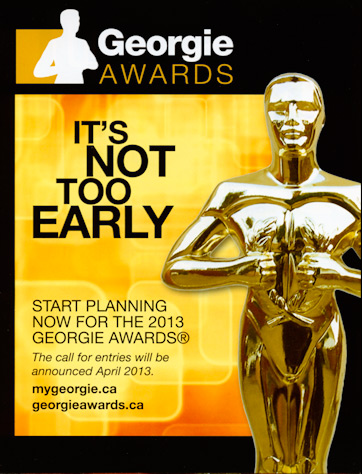
georgieIf you were at the Georgie Awards ceremony at the Vancouver Convention Centre a couple of weeks ago, you might have noticed this cleverly placed notice from the good folks at CHBA-BC in the back of your program brochure. If you weren't (or you were too busy enjoying the excellent food, drink and company) then...aren't you glad we're keeping you in the loop?

We wholeheartedly echo the sentiment: it's definitely not too early to get your awards submission photography done (whether you're submitting for the Georgie Awards, the Ovation Awards, the SAM Awards, the NKBA Awards, or whatever else you're entering).

There's something interesting and somewhat unexpected here: the date! Yep, you read it right: the call for entries will be announced April 2013. If you've been around the Georgie block a few times, you're probably thinking (as we are): "hey, that's really early!". Last year's call and deadline were at least a month later than usual (pushing the deadline into mid-October). What we don't know is when the deadline for entry will be, but we'll let you know as soon as the CHBA announces it.

While we savour the pleasure of helping our clients slide their entries in as "close to the wire" as possible (this past year, we shot our last project two days before the deadline, and were doing the last edits on that project a couple of hours before the deadline!), there are a bunch of reasons why being an early bird works better:

  1. Landscapes look fresher. If you're submitting a project that's exterior or landscape-oriented, having us photograph it in late spring makes for better photos. It's better light, flowers and landscape elements look fresher, and we probably won't even have to hose down your walkways because Mother Nature will do the job for us. (Waiting for a sunbreak can often be a challenge, but the wait is almost always worth it!)
  2. The light is more interesting. We'll soon be celebrating North Day, one of the unofficial photographer's holidays: the day when you start getting natural sunlight on north-facing buildings. The light in summer (and early fall) is a lot more interesting than in high summer: it comes from a lower angle, which emphasizes interesting textures and building materials.
  3. More flexible scheduling and time to work. If you have us photograph your project early, we're much more likely to be able to accommodate special requests and odd scheduling. Everyone will feel less rushed, and we can more easily schedule an extra shooting day to fill in details that aren't quite done yet later in the season--or have the flexibility to delay part of a shoot due to suboptimal weather.
  4. Reuse your images on other awards programs and marketing efforts. Many industry awards programs have relatively similar requirements for photographs, and having everything all wrapped up early means it's easier to use the same set of images and writeup for a bunch of purposes. You can also use your images on your website and marketing materials, show them to prospective customers on your iPad, or whatever you need. We're happy to reformat your images for diverse requirements once we produce your project.
  5. It's cheaper. Because of increased competition and tighter time requirements closer to the deadline, we charge extra for rush service close to the deadline. This also usually holds for other professionals working on your submission, not to mention having to pay your trades overtime to get things ready for a last-minute shoot.


By Georgie! Congratulations Symphony Homes

I had a great time at the 2012 Georgie Awards last Saturday seeing some great projects, catching up with friends, colleagues, and clients; and taking a small pile of photos for the next issue of Black Press's bcRenoNation--coming soon to the middle of a News Leader, WestEnder, or other community weekly near you.

But this year's was a little extra sweet: in addition to the projects we photographed that were finalists in this year's competition, we're extra proud of our clients Symphony Homes, whose Mahon Park Kitchen took home the golden statue for Best Multi-Family Kitchen Under $40,000:

Good work, guys! And congratulations again to our finalists, Victoreric Design Group and Tien Sher Development.

Go vote for the Ovation Awards People's Choice Award

Voting has opened for the GVHBA Ovation Awards' newest category this year: People's Choice! Vote here, and/or on Facebook. (Since Black Press is sponsoring it, and they're one of our clients, we can't vote...but we can still help get the vote out!)

Of course, we've photographed several projects that are up for voting in this category:


  1. Tien Sher's English Mews:
  2. Tien Sher's Quattro3:
  3. TQ Construction's Princess Park Kitchen:
  4. TQ Construction's Yale St. Kitchen (also prominently featured in this month's Home Decor and Renovations magazine, available in a yellow box in a street corner near you if you're downtown):

So as they used to say about voting in Chicago, vote early and often. We mean it: you can vote daily until the close. Voting closes on February 20, which is just a few days away, so go vote and may the best project(s) win!

Once upon a time...

It's always great to see a home feature end up in print, and it's even better when the home feature that ends up in print is one of a series. Thanks to the Vancouver Heritage Foundation (for which we're a proud in-kind sponsor), we're featured in this month's issue of Homes and Living Vancouver:

Homes and Living Vancouver - Feb/Mar 2013


Long one of Victoria's premiere house and lifestyle magazines, they "hopped across the Georgia Strait" last year and now have an edition for the Vancouver market; it's great to see them getting wide distribution and acclaim here. "Once upon a time" is expected to be a regular feature for this year; we have a number of fine heritage houses lined up for publication, so stay tuned (or better yet, go subscribe!).

This particular house may be familiar to some of you: it was on the annual Heritage House Tour in 2011, but as befits heritage houses where the work never seems to be really done, its interior has received a number of sensitive updates and refurbishments since it was on tour "back in the day". 

A Standing Ovation

We're proud sponsors of the GVHBA Ovation Awards (and have been since, well, before the GVHBA Ovation Awards were called that!), and besides sponsoring the awards, our Ovation Awards photography projects keep us busy during the late-fall and winter months photographing what often turn out to be some of our favourite projects of the entire year. It's even better when our clients make use of our photography to help them win! Last night the GVHBA unveiled the finalists for the Ovation Awards, and we're pleased to report that several of our clients are in the finals.

Porte's Origin project at UniverCity, an interior of which was featured in our calendars as the January/February photo, is a semifinalist in the Best Multifamily Lowrise Development and the FortisBC Award for Excellence in Energy Efficiency for New Construction: Multi-Family Home. Ironically, this project won an award sponsored by FortisBC by...not using FortisBC's product (natural gas, for those of you outside BC) for central heat. The award nominally requires photos of such things as one's mechanical room, window installs, and the central gas meter room. Since Origin uses district heat and a backup ground-source heat pump, I got the distinct pleasure of failing to photograph the central meter room because...there was no such place! Without further green building geeking ado:

Porte - Origin - Vancouver Condo Development Photo

 Tien Sher's Quattro3 also placed in the Best Multi-family Lowrise Development category. We originally shot this project for the Georgie Awards (where it's a finalist for Best Landscape Design), and it's great to see it show up  in the Ovation Awards as well. Incidentally, their website is a great example of using construction progress photos to keep people informed about the status of a project; something we don't often see yet despite us (and our friends at Braun/Allison, among others) recommending it as a good practice.

TQ Construction placed in the prestigious RenoMark Renovator of the Year - Large Volume category, and their Yale Kitchen project placed in the always-hotly-contested Best Kitchen Renovation: $100,000 and Over category. This cleverly designed kitchen features a clean, elegant design with a number of uncommon features, including an asymmetrical breakfast bar, tons of built-in storage, and grate-bottomed drawers allowing wet shoes to dry appropriately slowly 'for free' using an extension of the radiant infloor heating system.

TQ Construction - Yale St Vancouver Kitchen Photo


Victoreric Design Group's Chen Residence placed in the Georgie Awards and also placed in the Ovation Awards, this time in the Best Custom Home: Over $2 Million category. You've seen this lovely house on our website:

MKPhoto-7628-Edit

Mark your calendars now: awards night will be on April 20, and it's always a good party. We'll be photographing on the night, so if you see someone holding a flash high above the crowd, say hello! We're looking forward to seeing (to paraphrase Iron Chef) "who gets it? who will win? whose project will reign supreme!?", but in the meantime: congratulations to everyone who entered, and double congratulations for everyone now in the finals!