Photo of the Week - Home Decor and Renovations Cover

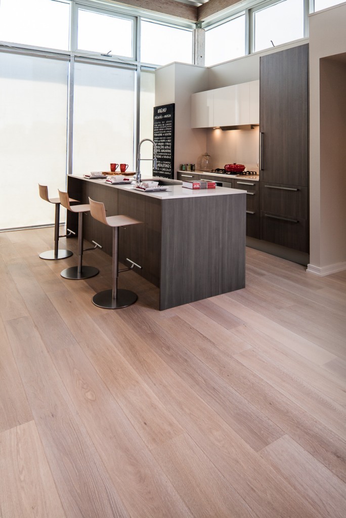
If you were in Metro Vancouver last summer, you probably saw the cover at left in a yellow box on a street corner near you for a couple of months:

2012HDandR Surfside Flooring original


Earlier today, I chaired the monthly meeting of the GVHBA Suppliers' Council, held in the boardroom of wall2wall Media, another GVHBA member. Wall2wall publishes this and a number of other local real-estate-oriented publications, and this cover was a result of a similar meeting some months ago. The editor working on this issue mentioned at the time that Surfside Flooring, a major participant in that issue, hadn't provided anything "cover-worthy", and was wondering if I would be able to run by a local showhome with their flooring installed in it and shoot something that would work for the cover--which was due to go to press in an uncomfortable few days. The logistics worked out great: the showhome was down near BC Place, just a few blocks away from the office, which meant that I could light, shoot, and edit the image, and have it over to them same-day in time to meet the press deadline.

It's conventional wisdom that "if you want more covers, shoot more covers", and we usually make sure to produce a few verticals (with a bit of gutter space at the top and bottom) on every project that might be featured this way just to make it easier for harried newsroom folks to get a good cover--and as a result, making it more likely that your project is the one featured. This is even easier when you know whose cover you're going to be on, but we had to cut it a bit close on this one: we were to feature the floor, but the showhome was in a temporary building with a weird metal ceiling, so while we would have usually left a bit more breathing room at the top given the size of the Renovations logo, we figured they'd either superimpose the logo atop the cabinets, or do a piece of easy Photoshop and cut some of the floor. As you'll notice, they took the entire horizontal length and edited out the unimportant area above the windows. It worked out just fine...and on deadline!


Photo of the Week - Streamlined Kitchen

MKPhoto-4267

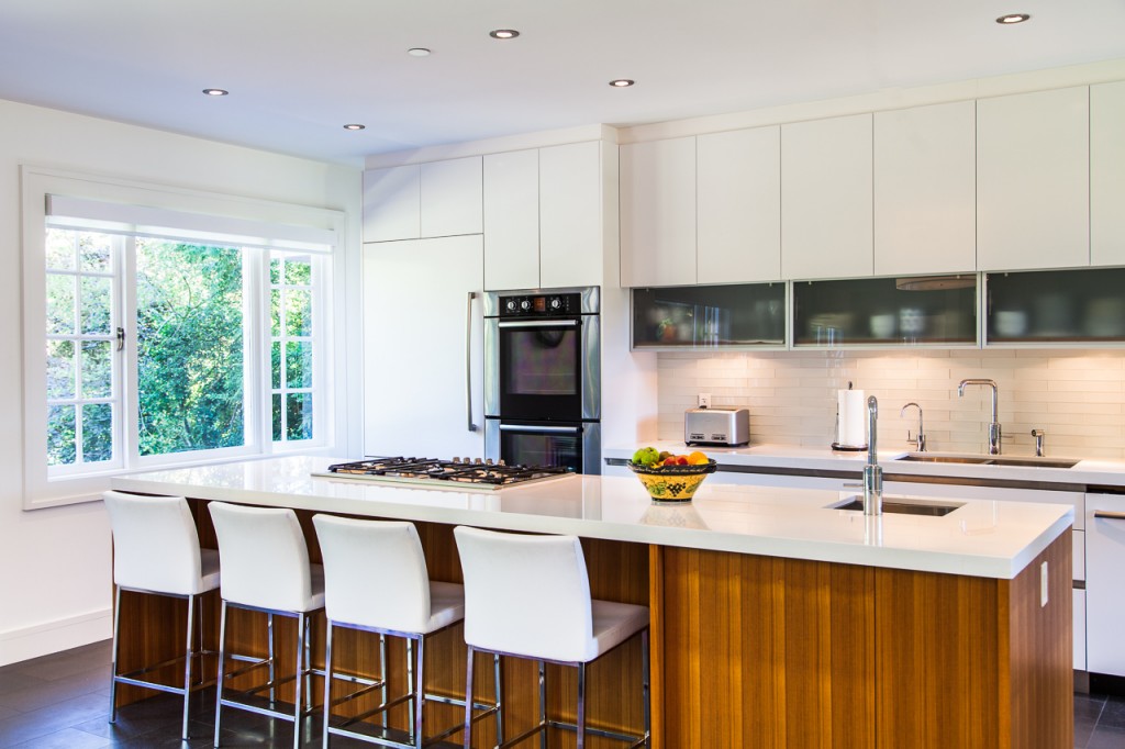
I photographed this sleek, streamlined kitchen while on assignment for Black Press's quarterly bcRenoNation (starts on Page 21) last September. The kitchen was renovated as part of a substantial rework by G. Wilson Construction of a stately but poorly cared for McCarter and Nairne-designed house originally built in 1932 on Point Grey. I'm a regular contributor to RenoNation, which has long been a "win-win" as we get to photograph a huge number of wonderful projects in a tight timescale (it's not uncommon for me to traverse the whole of Metro Vancouver in a couple of days photographing an issue of RenoNation), but it also means that the projects we feature often end up licensing the images after publication (and grabbing a number of outtakes that don't make it into print but are nonetheless useful) to the builders and renovators we feature, and doing future work for them on other projects.

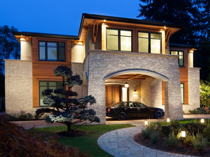
Photo of the Week - Campbell Residence

Vancouver Heritage Architecture - Campbell Residence twilight exteriorIt's time once again for the City of Vancouver Heritage Awards, and since our photos have been part of several major awards submissions (among them, Christ Church Cathedral, and the Blanca Street Residence), I thought it entirely apropos to feature this photo of the Campbell Residence, lovingly restored, completed (the entire top floor was mostly unfinished when we first photographed it as construction began) and updated by owner and VHF Founding Pillar Janet Campbell, architect Robert Lemon, and Murray Wystrach Construction. Good work, everyone!

It's always insightful photographing a project like this at steps between initial demolition and completion. We photographed this house annually for the two-years-and-change the house was under renovation, which makes for a nice photo archive for both the current owner, future owners, and anyone wishing later to research the history of the house. Here's how the rear elevation above looked when we first saw it:


Photo of the Week - Kelmore Rd. Foyer


MKPhoto-9205-Edit

I'm more than a little late with the Photo of the Week this week due to New Years' and being on the road, so...apologies. If you're a longtime client of ours, you probably have a small collection of Martin Knowles Photo/Media calendars (and if you haven't gotten yours yet this year, please let us know--chances are, yours is either on the way, or it's instead found its way to the floor in some post office somewhere) For several years running, it was a tradition of sorts to start out with the January photo being either a nifty staircase or a nifty door. Something about either opening a door to a new year or starting the climb from the bottom, or some such. This year's calendar broke with tradition, although there is a visible staircase. So...here you go. This foyer is part of a newly built home on Kelmore Road in Richmond, built by YCW Contracting--whose web site we'd link to if they had one up, which they seem not to yet (but are probably working on it!)


Hooding the Canon TS-E 17

I make good use of my Canon TS-E 17mm, especially when shooting straight on into small interior spaces like bathrooms, kitchens, and other tight spots that we Vancouver architectural photographers are challenged with shooting on a regular basis. It's a great lens when used with deft hands, and the optical quality is amazing. While I notice a bit of softness using the 1.4 TC, it's still far and away better than the old TS-E 24, though the TS-E 24 Mk II is on my "stuff to buy before the HST comes off" list of upgrades...that's assuming I don't move to medium format first.

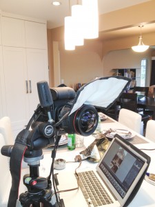
But as amazing a piece of glass as the TS-E 17 is, there's one little problem: that "pregnant" front element. While it's less flare-prone than one might think by looking at it, I still run into problems particularly if there's a small, intense light source nearby--like a PAR spot or high-wattage MR16. When shooting the Yale St. Kitchen featured as Photo of the Week a couple of weeks ago, the combination of several PAR spots and the bright above-counter lighting made for a serious flare problem. Since there is no official hood (and even if there was one, it would be little more than decorative most of the time), I've often used the black side of a Honl Speed Gobo, handheld, as a flare card. This wasn't going to work here, because I was planning to shoot tethered from a ways away to avoid having myself reflect in several highly reflective surfaces. What to do?

IMG_0427 IMG_0428


In one of those blinding flashes of insight that one is sometimes blessed with on location, I caught sight of the small Rogue FlashBender in my grip bag and decided to use it for a hood by wrapping its elastic around the mounting collar of the TS-E. It works, mostly. A few caveats:

- The strap is snug on the lens collar (though nothing that either a piece of double-sided Velcro, or a bit of [ab]use won't fix).

- This means that you will jar your lens slightly when putting the FlashBender on. So, lock your shift setting in before mounting the FlashBender and bending it into position. (If you're careful, you can hold your focus when doing this.)

- The strap will cover your shift controls, so shift and compose first before putting the FlashBender on. (And lock your shift setting. You've been told twice now.)

- It often seems easier to mount the FlashBender, then look into the front element of the lens for points of light, and adjust the FlashBender from the front before finally checking it through Live View for focus, lack of vignetting, etc.

Interestingly, I've always found the small FlashBender to be one of those "mostly wasting space in my grip bag" items, since if I'm going to be using a FlashBender as a snoot or bounce, I usually use the large size instead--so this lighting modifier has finally found its true calling in my camera bag: as a flexible hood.

Photo of the Week - Merry Christmas, all!


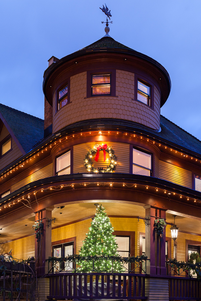
Vancouver West End Lights - Rand House...and as Martin flew out of sight for a well-deserved break, we heard him exclaim: "Merry Christmas to all, and to all some good light!". Wait. What? Isn't it supposed to be "to all a good night"? Well, that too. Have a happy (and well-lit) holiday!


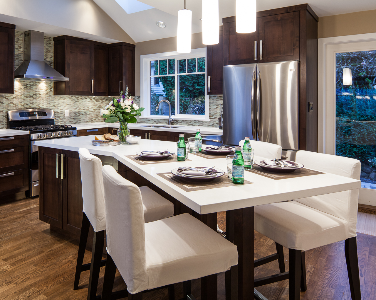
Photo of the Week - Yale St. Kitchen

Yale St. Kitchen - Vancouver, TQ ConstructionIt's official: as of yesterday, the Awards Season that Seemed to Never End, finally ended. This year, the Georgie Awards ran late, and the GVHBA Ovation Awards ran early. Throw the CHBA SAM Awards and the NKBA Awards (at least) into the mix, and it all adds up to a crazy run of cool projects to photograph, stressed-out but appreciative clients, and last-minute tweaks...starting in about mid-July and ending yesterday. Now it's time for all of us Vancouver architectural photographers to take a collective breather...before burning a lot of CDs, catch up on billing, and all that. Oh, and preparing to start work for keen interior designers wanting to beat the rush for getting projects photographed for the IDIBC Annual Awards, which are coming right around the corner. (OK, maybe it doesn't really end after all!)

This kitchen, designed by Burnaby-based TQ Construction, was one of our favourites out of a bunch of projects we photographed for the Ovation Awards this year. It has a great mix of modern convenience, classic charm, and smooth usability; and cleverly fits into a rework/addition on a 1940's-era house in the northeastern corner of Vancouver.

For the curious: this image is (outside of the usual tweaks in Lightroom) unretouched. There are about 6 variously modified but cleverly hidden (from camera perspective) LED hotlights placed around the space.


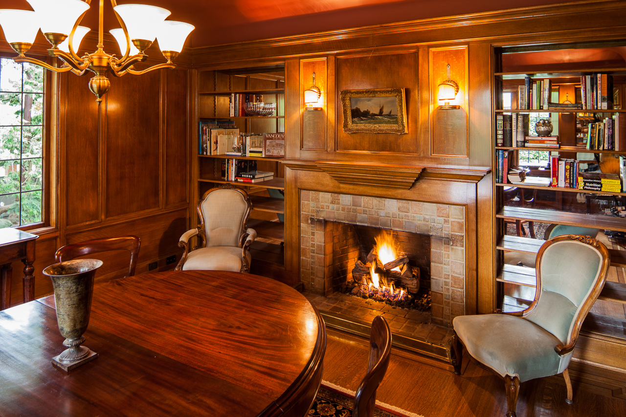
Photo of the Week - Fireside Chat

MKPhoto-5015-EditWe're longtime supporters of the Vancouver Heritage Foundation (in fact, I was volunteering for them well before Martin Knowles Photo/Media even existed!), and it's no surprise that having photographed nearly every house tour (and them some) over the better part of the last decade, I have a huge image archive to share with them. This year, they started putting out an email newsletter, and almost every heading image they use is a creative crop from one of my images. I'll talk more about cool cropping tips on this blog later, but suffice it to say: it's always a nifty surprise to see what image they choose and what they do with it.

This is the uncropped version of their newsletter image. Despite the cozy appearance, I photographed this in late summer, with the help of a couple of low-mounted speedlights and a cloudy day. The fire is real, which is a rare treat: normally, we get to Photoshop a roaring fire like that!

Photo of the Week - Buchanan Building Bike Shelter

Bruce Carscadden Architecture - Buchanan Bike Lockup

As many of you know, I'm an all-weather cyclist...and yes, that is my commuter bike (cleaned up for the occasion) serving as a prop. Judging from their recent Bike to Work Week scores, so are some of my clients. This Photo of the Week is brought to you by the letter B: this bike shelter is at the Buchanan Building at UBC, built by the also-bike-brandishing Bruce Carsadden Architects. We photographed this almost exactly two years ago when it first opened, and it's a classic Bruce Carscadden project: combining an awareness of usability, solidity of form, a sense of (as one of their architects put it) thrift and efficiency in materials and expression, and a certain durable playfulness that dresses up what would otherwise be a somewhat banal utility space. 

Photographically, it's an example of the usefulness of winter light. This photo was made with predominantly available light and a small amount of flash fill. While Vancouver weather in December is usually grey, dark, wet, and generally blah, when we do get a few minutes of winter light, it can make for interesting photos if the conditions are right. Winter light (when it happens) is crisp and low, and does a great job of jazzing up a due-south-facing project like this one. The louvers show well in this sort of light, which penetrates deep into the structure to highlight the vertical and horizontal elements that make up the walls of the project.

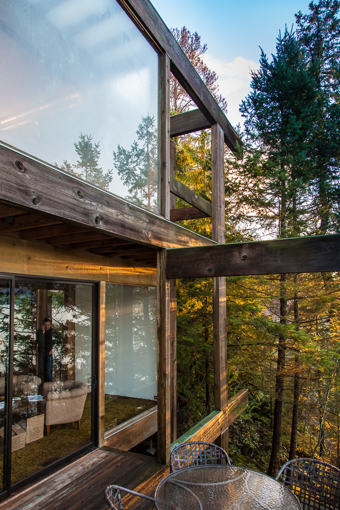
Photo of the Week - Midcentury Modern Goodness


Catching last light at the Staples Residence out in West Vancouver (it's on the end of the south bluff overlooking Horseshoe Bay). The Staples Residence was designed by Bruno Freschi and Erickson/Massey and, I'm told, has recently been sold to new owners. We've been enjoying an unseasonably dry stretch of weather here in Vancouver, which is great for us architectural photographers with clients who need exteriors photographed for the Ovation Awards and end-of-the-year website updates.

This one wasn't for a client, though; it was one from of a whole series of receptions I've been attending and photographing as part of the West Vancouver Museum's series of midcentury modern home openings to go along with their retrospective of local photographic legend Selwyn Pullan. While I don't usually do event photography, I make exceptions for events that also happen to get you into interesting houses and/or put me in contact with other interesting creative types especially of the architecture and design persuasions.

If you haven't gotten yourself a copy of the book yet, and you're a fan of midcentury modernism, go buy it--your eyes and your coffee table will thank you. Selwyn Pullan is one of the most faithful photographic scriveners of Vancouver modernism, and his work for years photographing in Western Homes and Living (which you probably know as westernliving these days) is both beautiful in of itself and has been used by some new owners of midcentury homes as a guide for removing "remuddling" and restoring original features (or choosing not to, as the case may be).

Along with the book (available at the museum), there's a whole exhibition of Selwyn Pullan photos on at the museum until December 15, and admission is by donation.


Congratulations Georgie Awards finalists!

The finalists for the Georgie Awards were just announced today. For those of us in the Vancouver area, the Georgie Awards are one of the most prestigious (along with the SAM and Ovation Awards) awards for excellence in residential development. Our Georgie Award photography has propelled projects into the spotlight for five years, and we're very proud to be carrying on that tradition with several of our clients in the finalist category! It's always great to be photographing good work, and even better when our clients get recognized for the work they do:

Victoreric Design Group's jaw-dropping Chen Residence, finalist in the Best Single Family Home $1.5M-$3M category. This is one of those wonderful projects where the dozen photos you're allowed to submit don't quite do the place full justice, so we're featuring this project as well.

Victoreric Design Group - Chen Residence

Symphony Homes' smartly appointed Mahon Park Residences in North Vancouver, in the Best Multi-Family Kitchen category.  (Yes, that's a 6-burner Viking gas stove. And yes, I want one!)

Mahon Park Residences Kitchen, North Vancouver

And, certainly not least, Tien Sher Group of Companies' deft-handed exterior of Quattro3, finalist in the Best Landscape Design category.

Quattro3, Surrey BC

We won't find out who the winners are until late February, but in the meantime: congratulations, everyone!

IDSWest Behind The Scenes

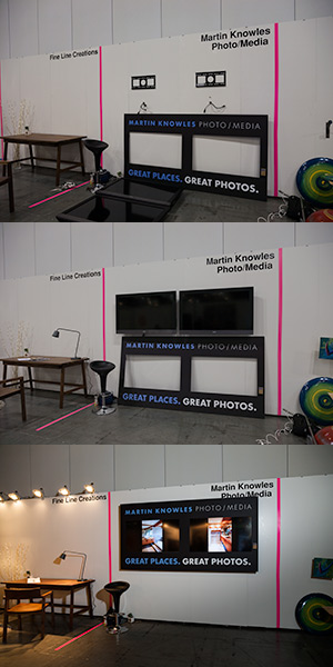
Martin Knowles Photo/Media at IDSWestIf you're visiting here, you might know that we exhibited recently at IDSWest, and if you stopped by our booth…well, it was great to see you! (And if you didn't make it to IDSWest, you missed a rippingly good show full of inspiration and creative goodness. Hey, there's always next year…).

In addition to meeting a lot of wonderful people, I received a huge number of positive comments on our display design, along with more than a few interior designers "peeking behind the curtain" to see how we put things together. The design fits a number of our values, including being highly effective and economical at the same time, providing a clean and modern look, and minimizing waste. As you can see, it's pretty straightforward stuff. Just a couple of 46" flatscreens on flat mounts and a mask that's built from black foamcore with vinyl lettering. The foamcore and lettering work were done by our friends and fellow GVHBA members over at FastSigns Coquitlam. The two screens are controlled and coordinated by a piece of custom code I threw together, running on my MacBook Air in back; if you're building a display like this and don't care about synchronizing all the screens, finding a display with "digital photo frame mode" will probably do the trick and save you a lot of frustration and anguish.

The total expense for the display itself was under $800 (that's not counting the cost of actually exhibiting at IDSWest, of course) given that we got the two screens on auction and the mounts from a local liquidation store. The rest of the bits and pieces came from our location grip kit or our usual tradeshow display setup.

There were a few little wrinkles: that's a full 4x8 sheet of foamcore, and the van I rented to bring everything in was about 4 inches too short (and foamcore with most of the central portion missing won't travel well on a roof rack). I also got to do a bit of reinforcement on the wall: there's a lot of weight up front, so it required a couple of torsion bars and a few sandbags in back to offset the weight and reduce the possibility of having the whole wall coming down on us and our fellow exhibitors. (The back wall at Studio North was composed of two pieces of 3/8" MDF; heavy bolts and fender washers were a must). 

If you've been to a recent IDIBC or GVHBA event, you've probably seen the "baby" tabletop version of this display, which sports three smaller screens. It's the same concept, just with a bit of extra wiring, more complicated mounts, and some extra structural support and design work so as to make the whole thing break down into a large hockey bag that slides into the back of a subcompact car with the seat down or (with a hand truck and a couple of bungee cords) can be transported in one piece on Skytrain or Harbour Air.